

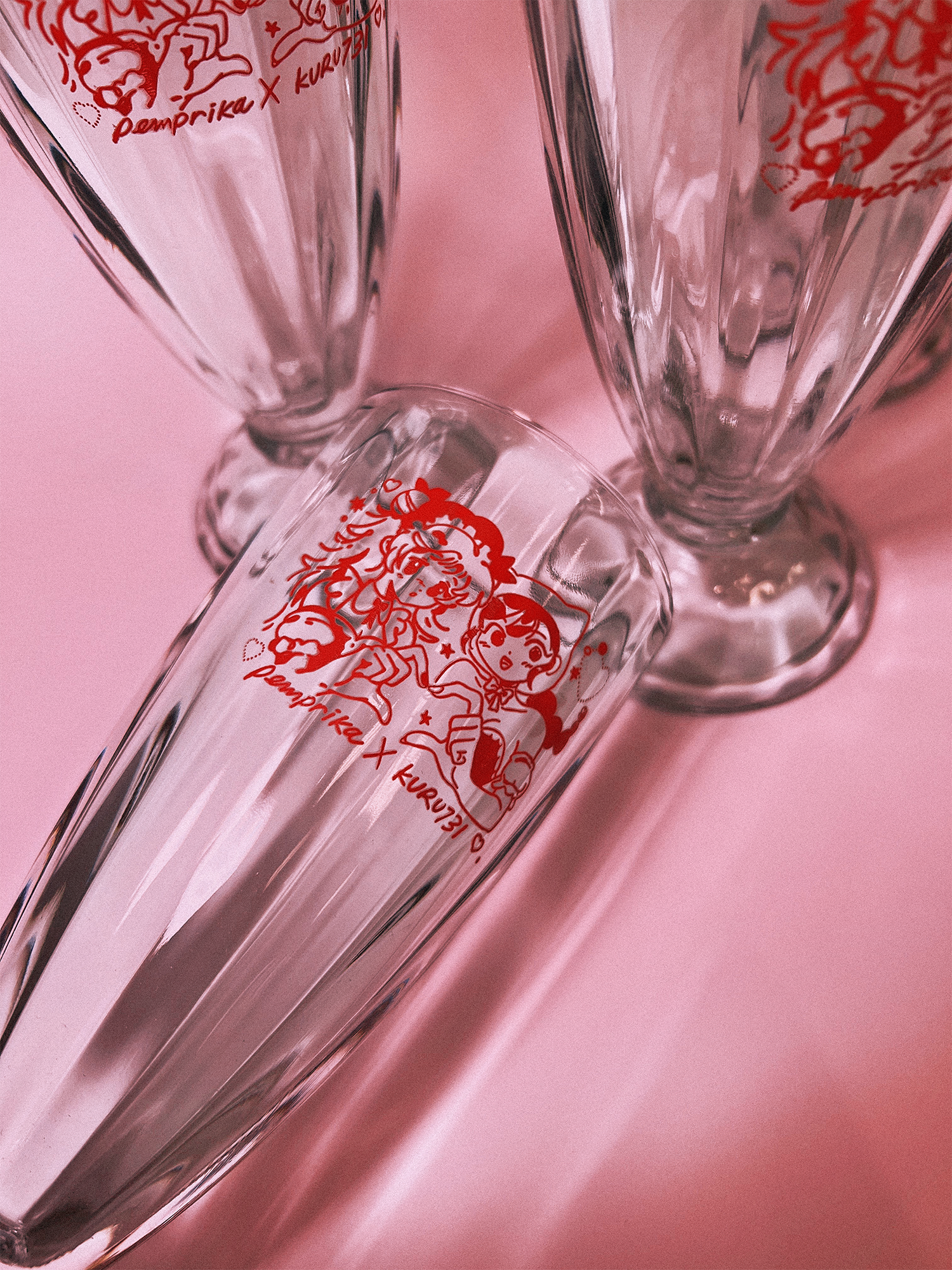
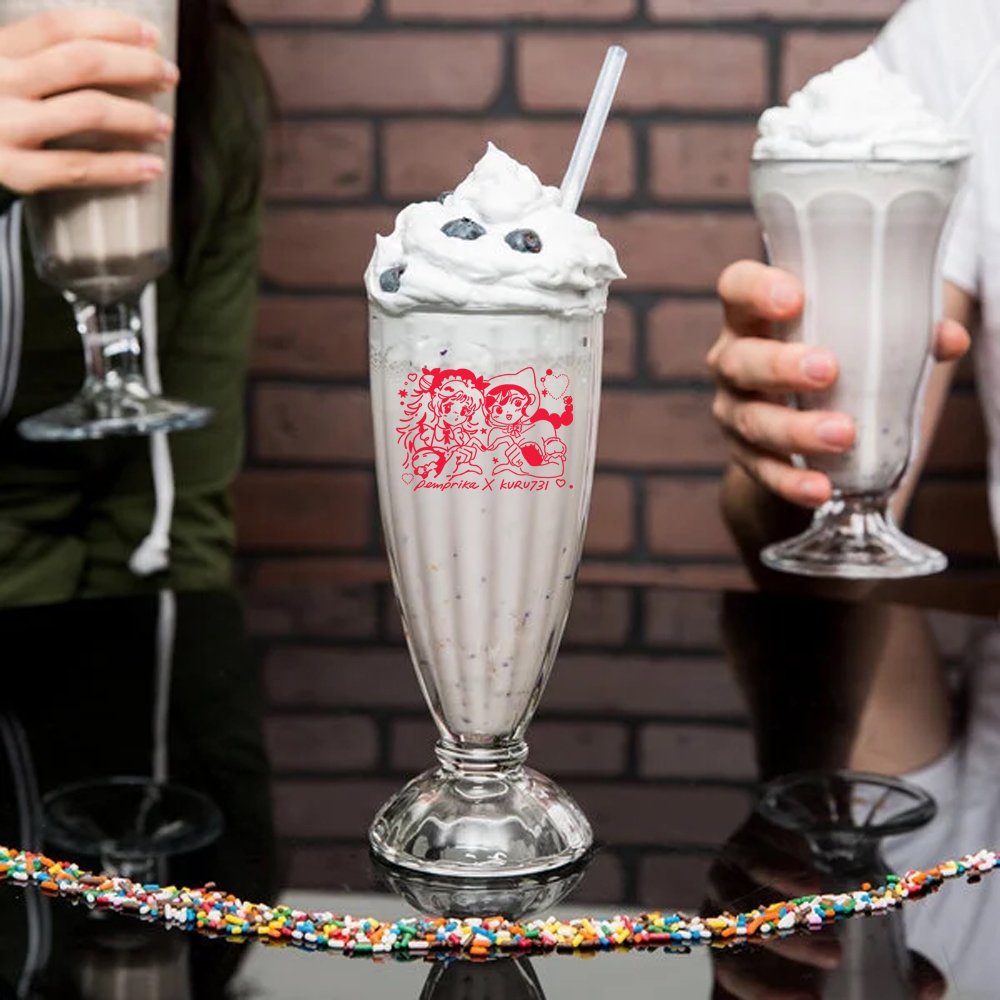
“GLASS HEARTS” SODA GLASS
Original product & stamp rally design
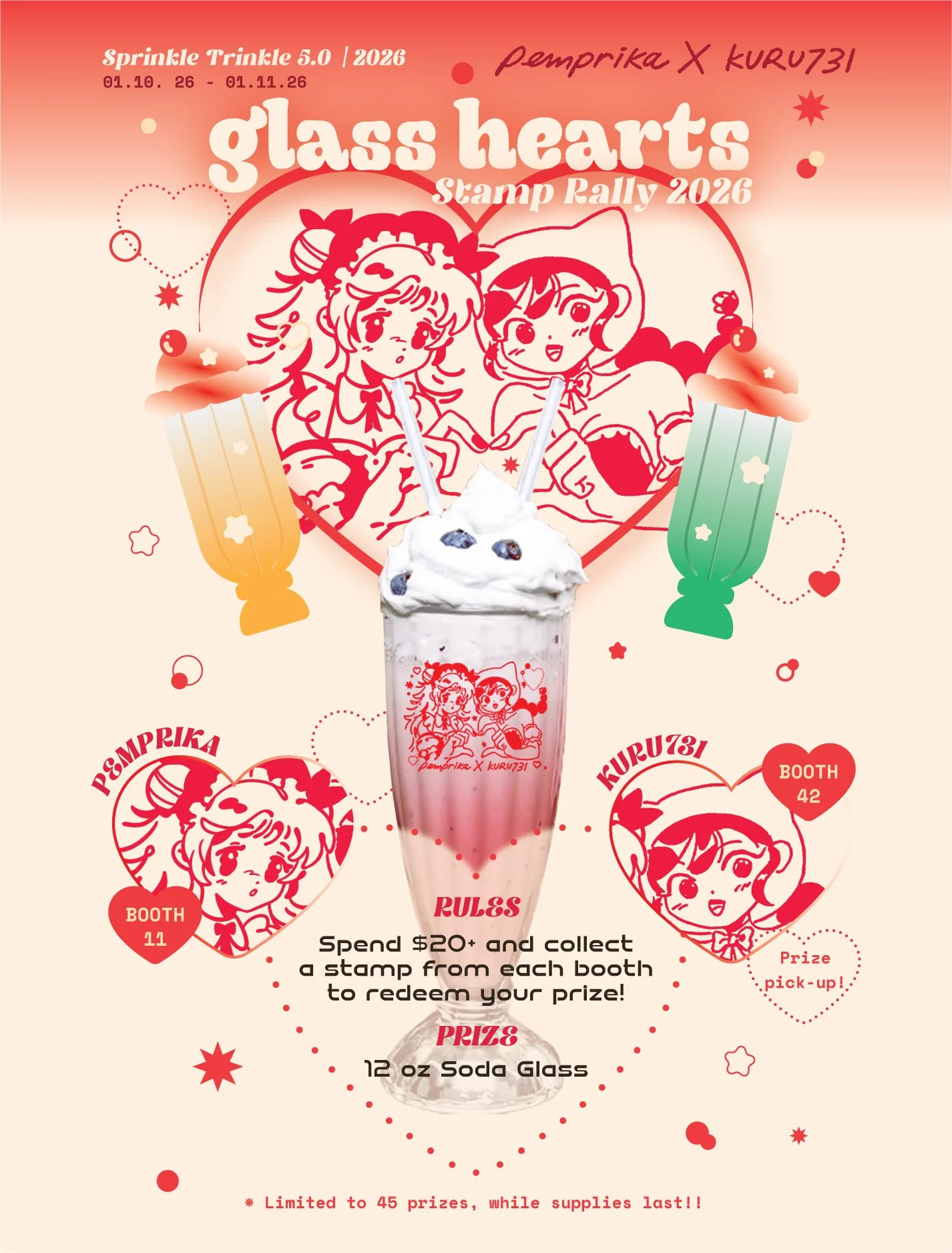
An original collaboration to make a Japanese cafe themed soda glass design by Janet Sung and myself. As invited guest vendors at an art market during January 2026, Janet and I worked together to create an original stamp rally using soda glasses as our prize product for the show.
TIMELINE
Dec 2025 - Jan 2026
(1-3 weeks)
ROLE
Illustrator, Graphic Designer
Social Media Marketer
TOOLS
Illustrator, Illustration, Photoshop
What’s a stamp rally?
A stamp rally is a popularized game-like scavenger hunt activity that originated in post-war Japan to boost marketing, where participants collect a number of stamps from different locations or booths on a flyer in exchange for an exclusive reward!
IDEATION
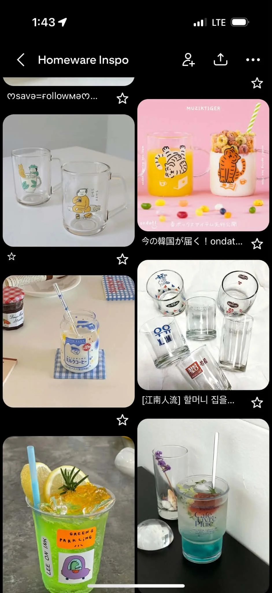
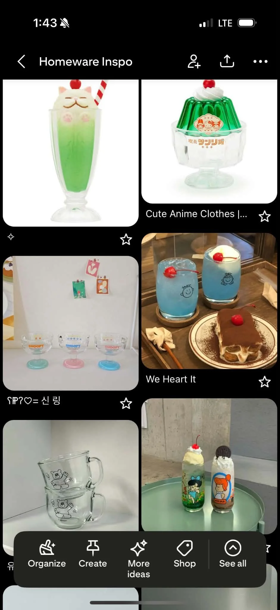
Why a soda glass?
We love drinks. Janet and I wanted to bring something practical and usable for the attendees to take away from the event.
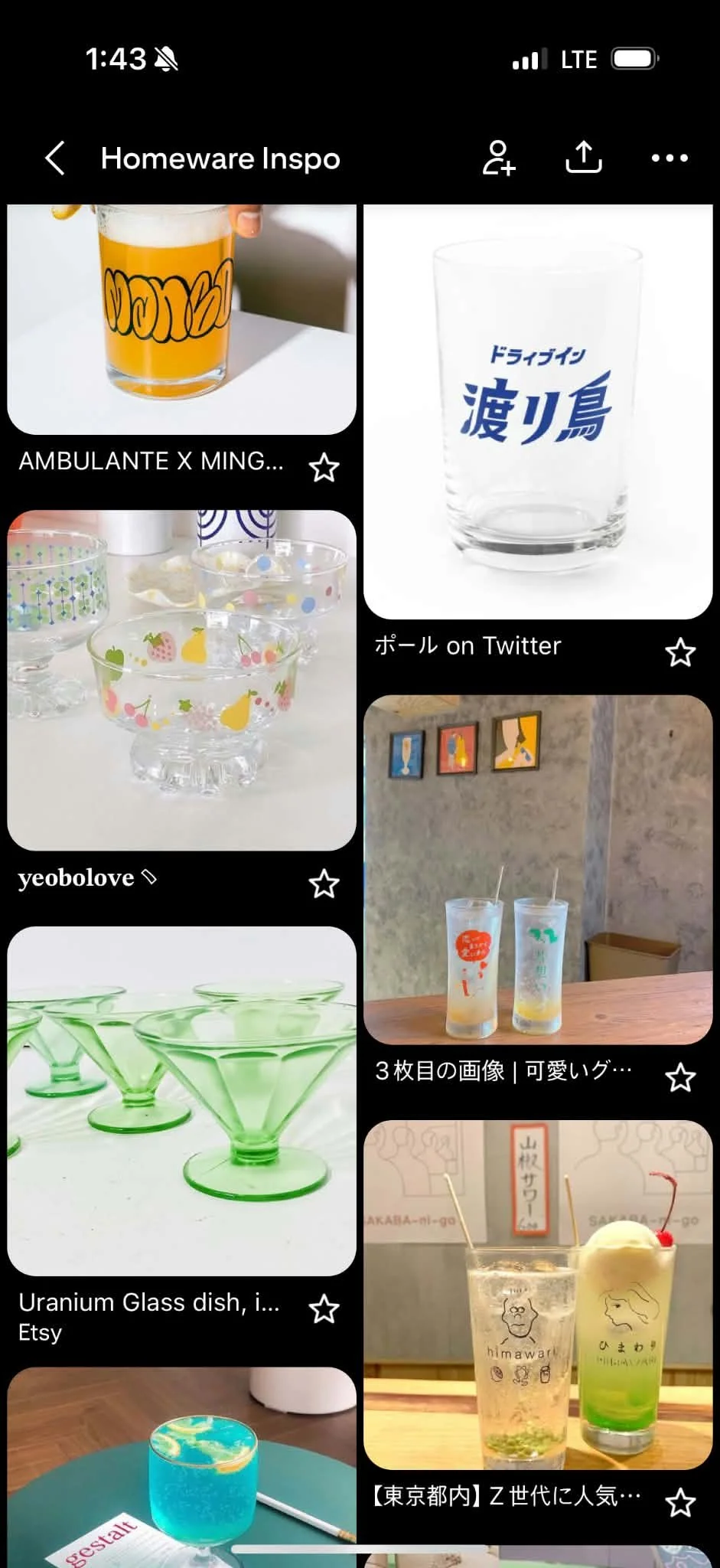
When looking for soda glass inspiration, we curated a collection of cute, colorful, and bubbly shapes and colors.
We hoped the design would make the beverage more enjoyable to drink in, and make the drink itself look appetizing to consume overall.
Color Palette
We were deciding amongst shades of pinks, reds, and greens, and were drawn to the center shade of red to ensure visibility against darker shades of liquids.

Sketching
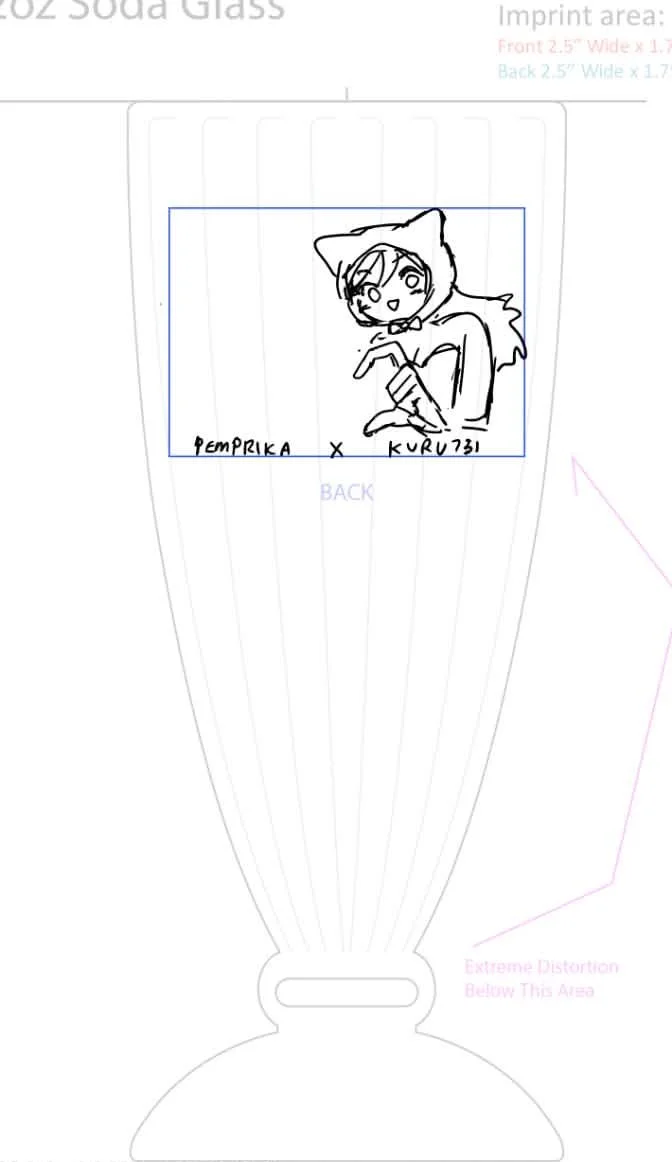
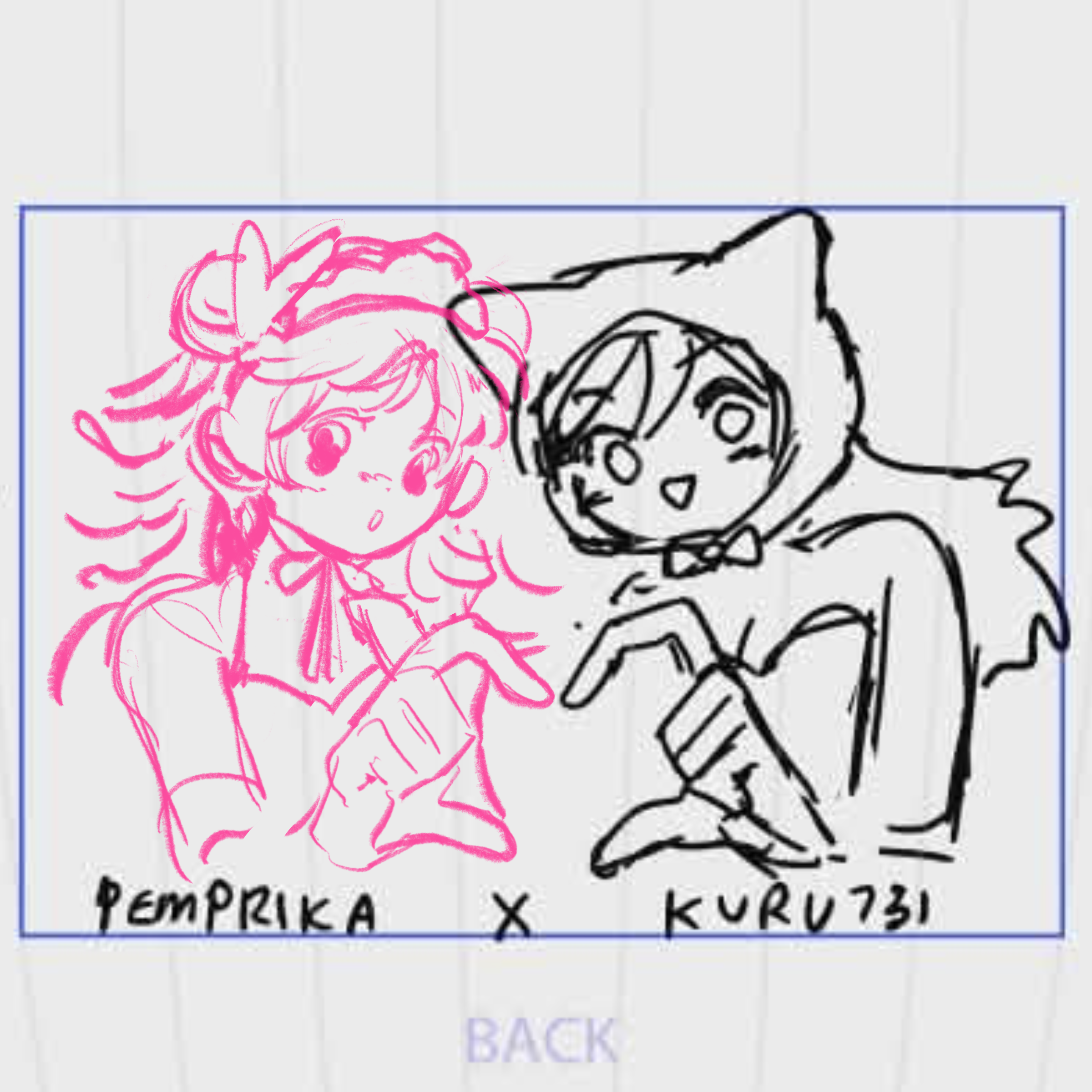
Our concept was to illustrate two characters forming a heart together in maid-themed outfits. Janet started her thumbnail, and sent the draft to me to use as a reference for my own character. See my sketch in pink on the left vs. Janet’s sketch on the right.
DESIGN PROCESS
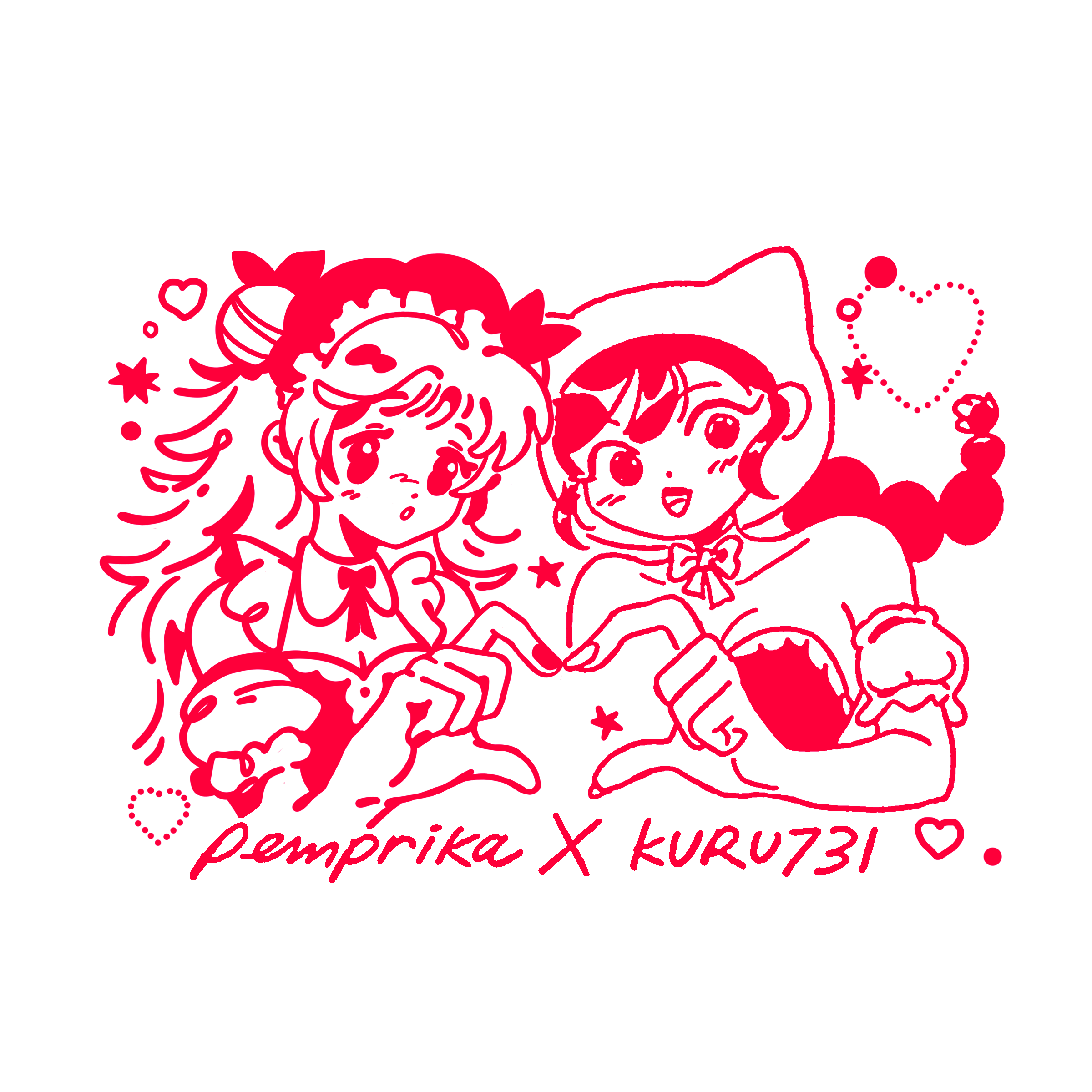
Finalizing the Logo Design
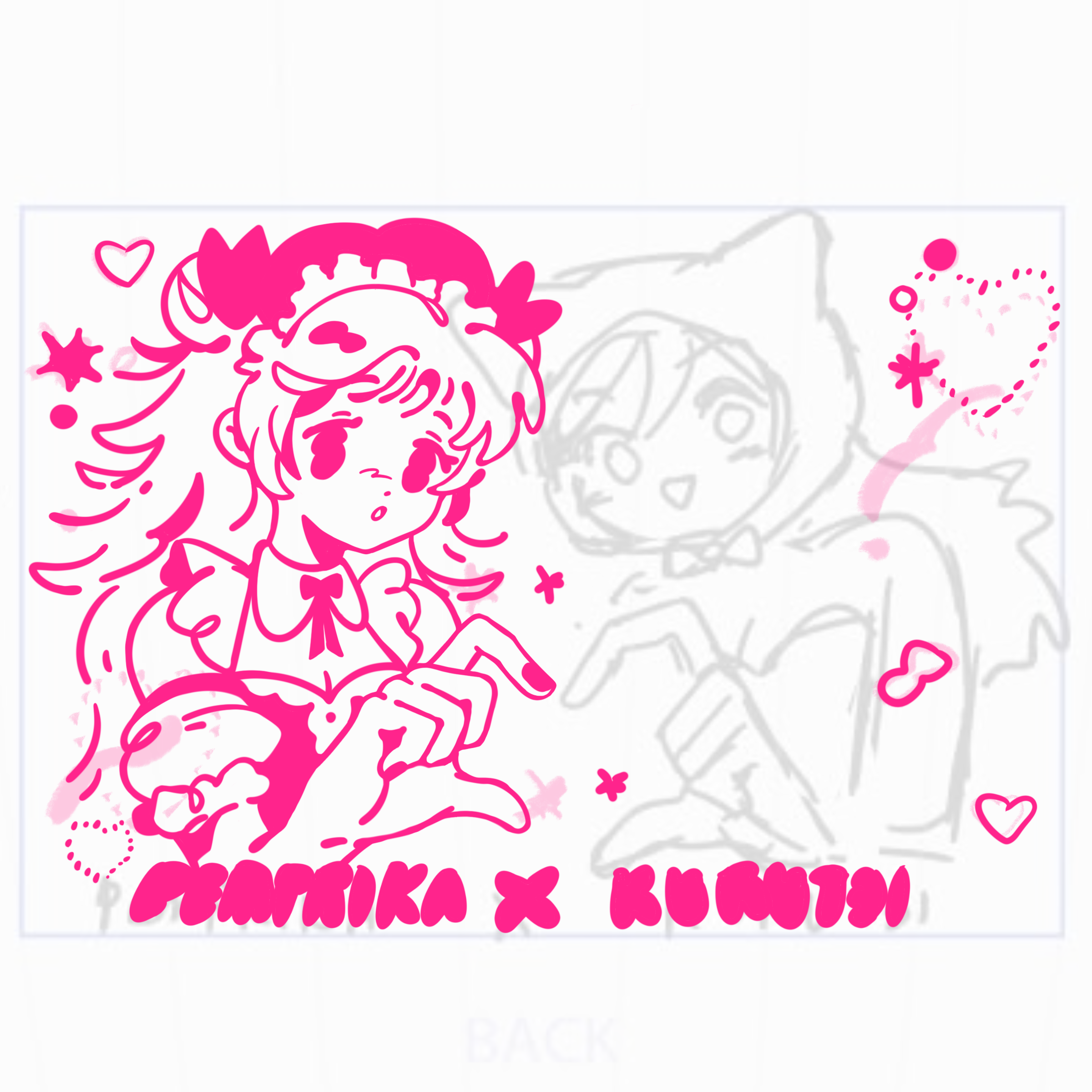
We solidified our logo design within a week due to our constrained logistics deadline, and managed to pull the design together despite working on different schedules and programs. I was initially concerned with how inconsistent the stylization may turn out, considering little time we had to revise our work, however, the illustrations worked out better than expected with our team synergy.
The version on the left is the revised draft of my own design, and the logo right is the final design all together.
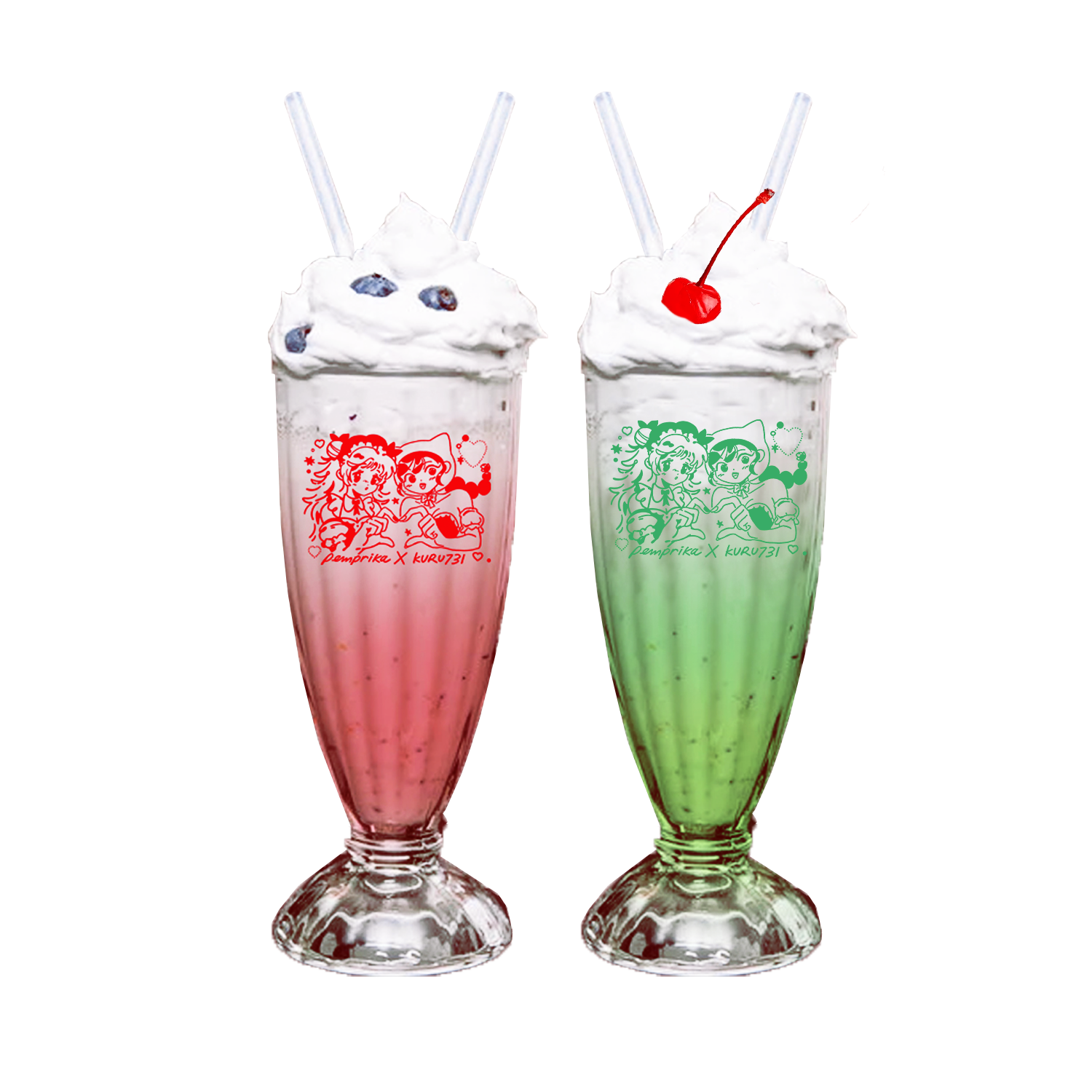
Soda Glasses in Production
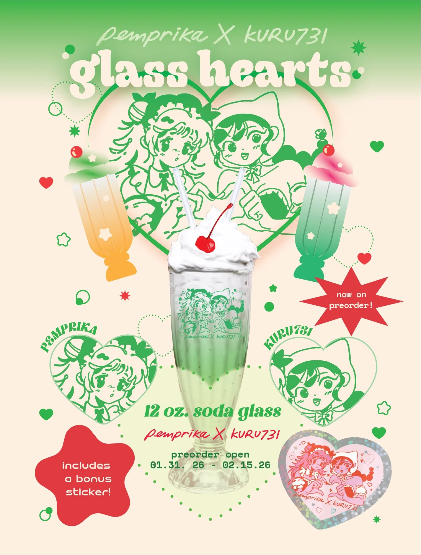
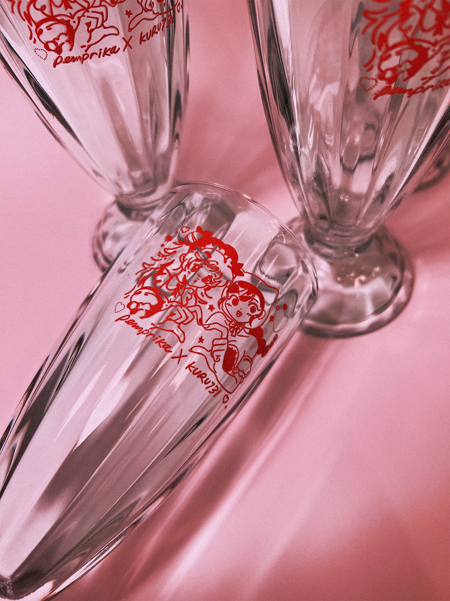
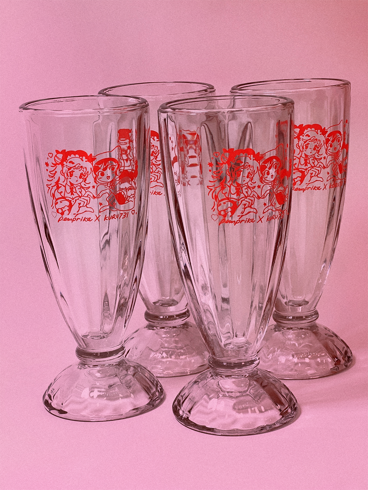
Tragically, there were a few cups that did not survive the transit. Regardless, we were really thankful the soda glasses turned out durable and adorable. We ended up making a green version after the event due to high demand of customers wanting a chance to purchase our product.
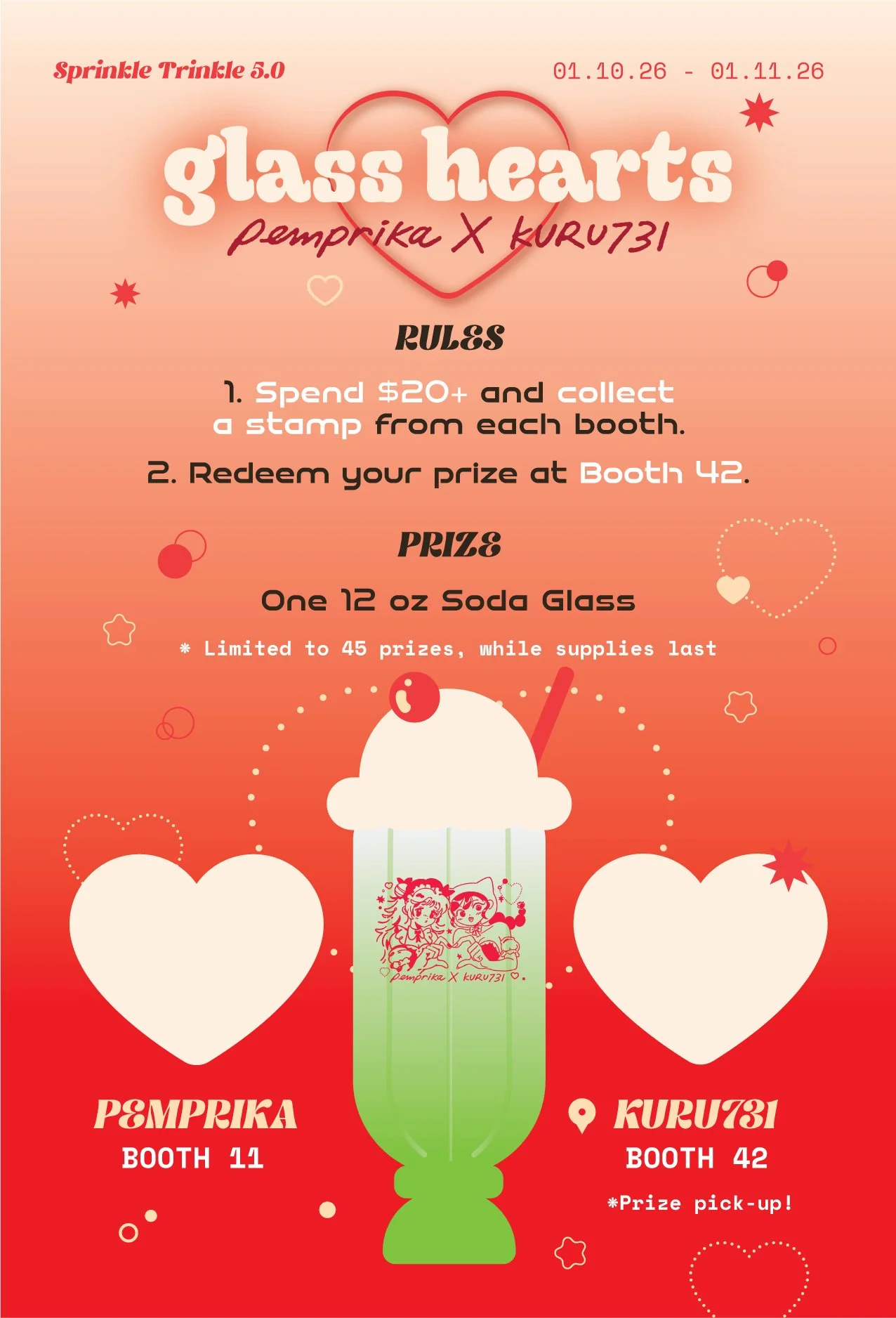
The stamp card
I designed the stamp card of the stamp rally, adding a front and back design to showcase the cup and leave enough room to write the rules in a simple, legible format.
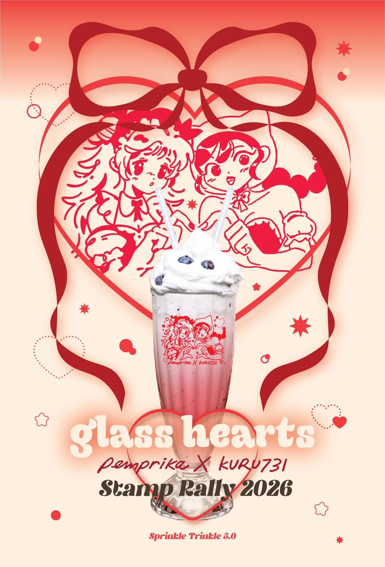
Social Media Marketing & Promotion
I remade the graphics into promotional content by rearranging the assets and prioritizing more useful information and key words. I hoped to make it similar enough, but still unique for the eyes on social media.
Overall, the posts did way better than we had expected, sparking engagement up to 80,000+ views and 5,000-10,000+ likes across all platforms.
TAKEAWAY
Our original soda glass idea began on a whim while we were brainstorming practical products to offer to the event. The timeline was extremely short, with only less than week to lock in a design, and 2 weeks for production. It was my first time designing a home good product, and I’m thankful we had a chance to execute the design collaboratively.
Improvements for next time:
With the constrained timeline, we had very little time to revise and make any thoughtful changes. We also noticed that on our cups, the paint were scuffed on a few of them. In the future, I hope to plan more ahead when designing a product, as we could have had time to order samples, and quality check the glasses before distribution.