
ENSO DESIGN
Branding | Logo Design
Enso Design is an interior design studio that focuses on quality, modern, and luxury construction services. I worked with Camy Doan, the owner, to bring Enso Design to fruition, fleshing out the values of her business model to designing the face of her startup.
TIMELINE
Nov - Dec 2022
ROLE
Brand Designer, Graphic Designer
TOOLS
Illustrator, Photoshop, InDesign
IDEATION
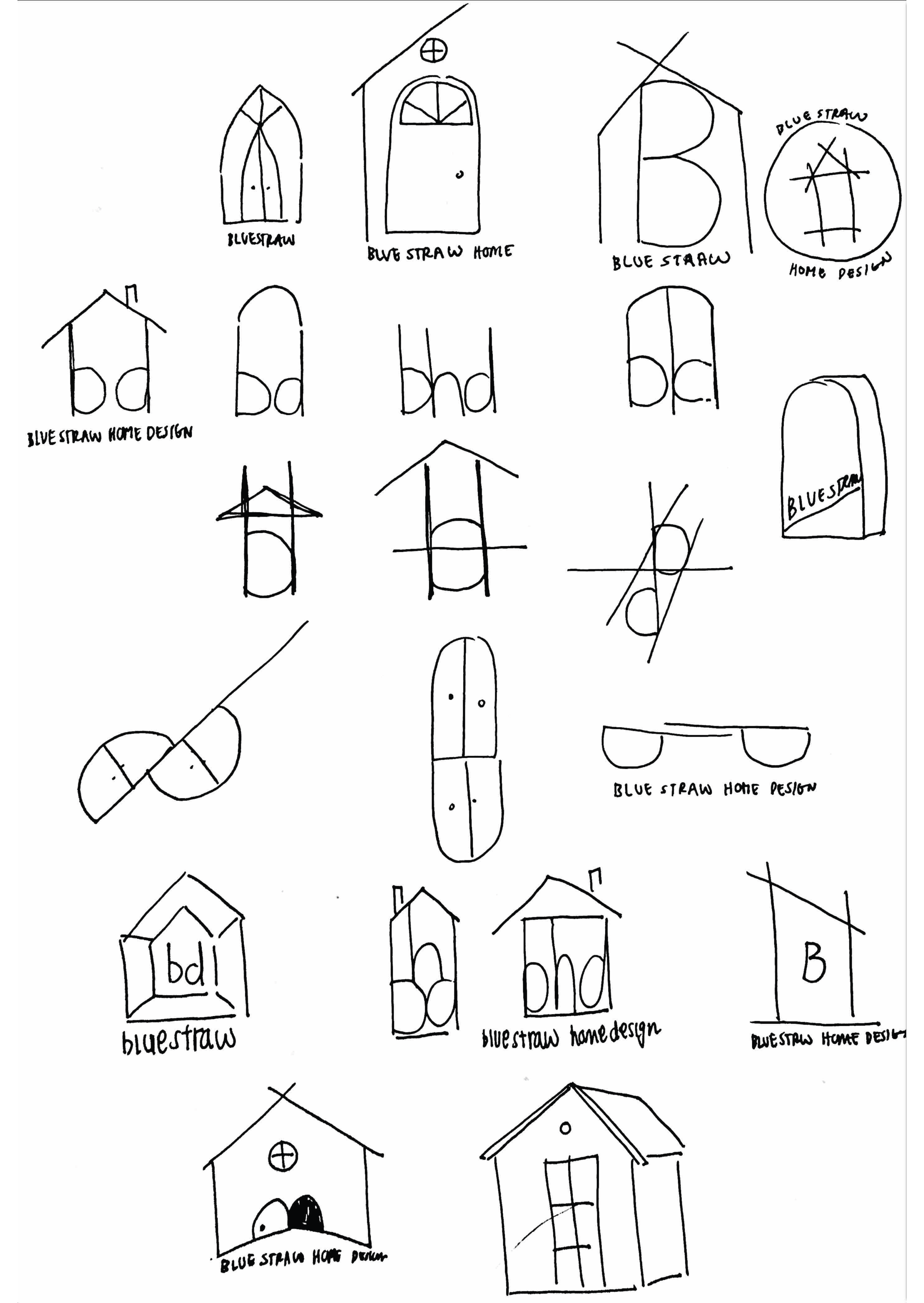
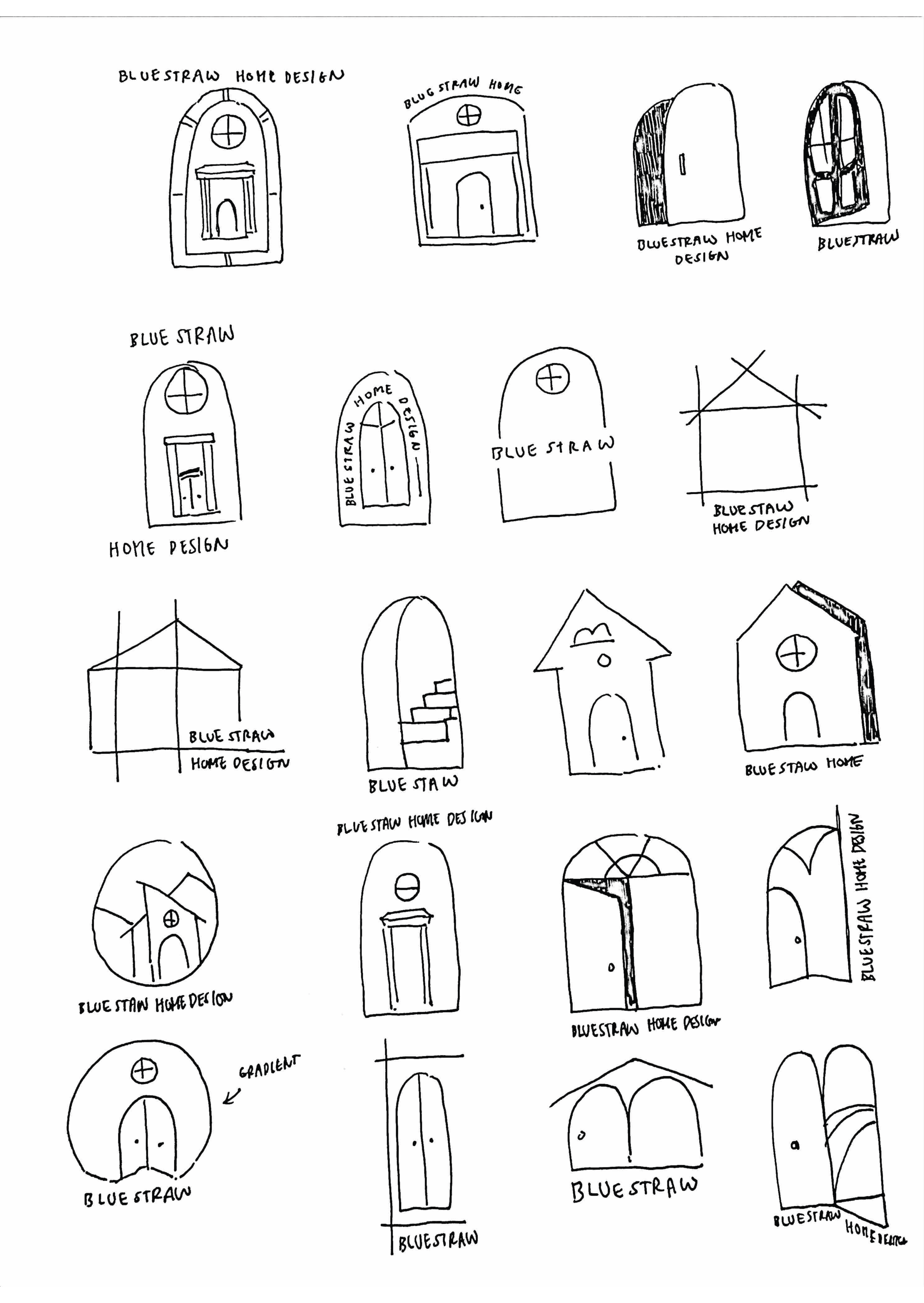
Sketching & Brainstorming
At the time of ideating, Camy was still debating on her business name, giving me full range of creativity to work with, which also made it challenging for me to narrow down her preferences as we talked through the ideas.
DESIGN PROCESS
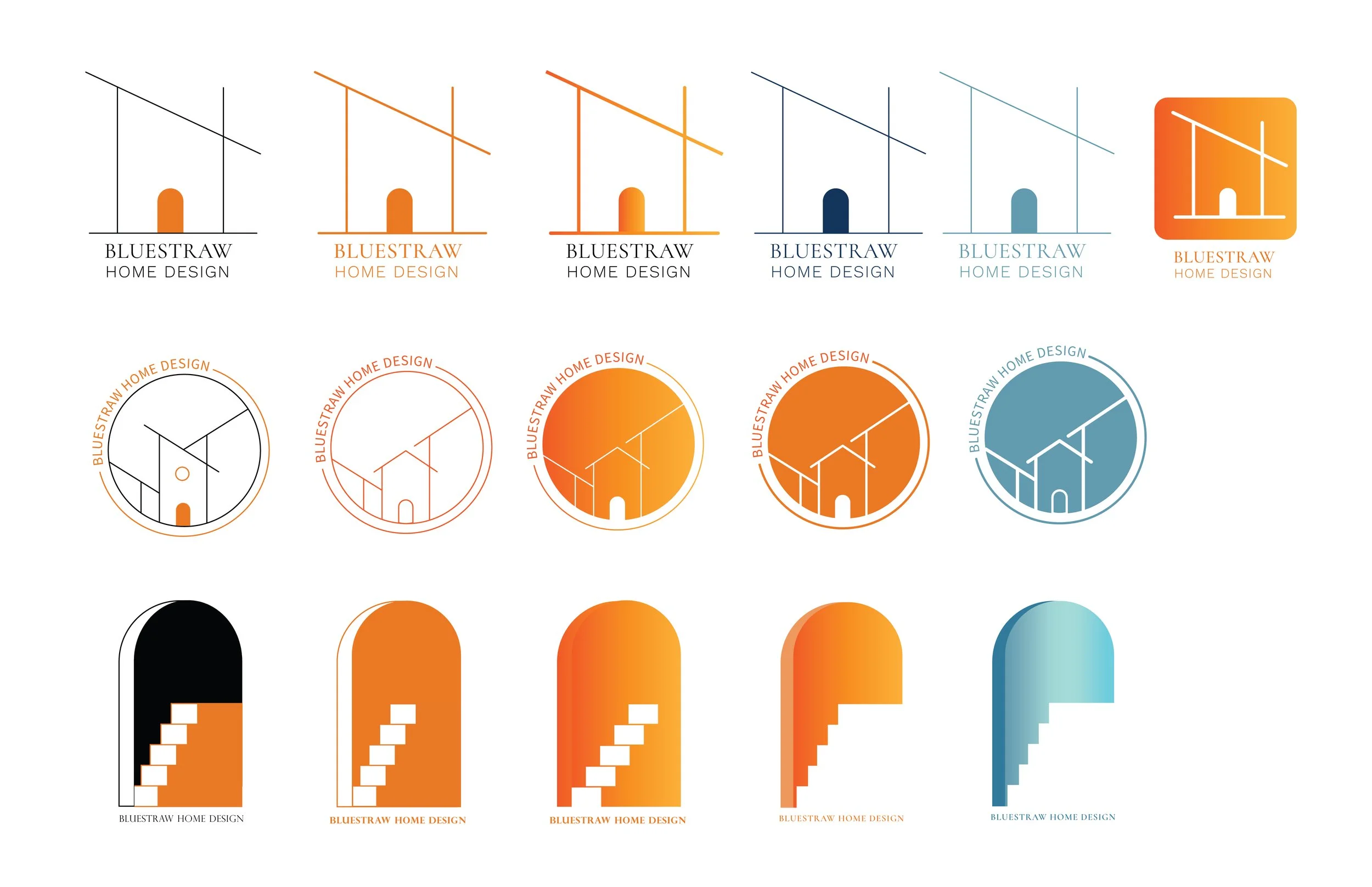
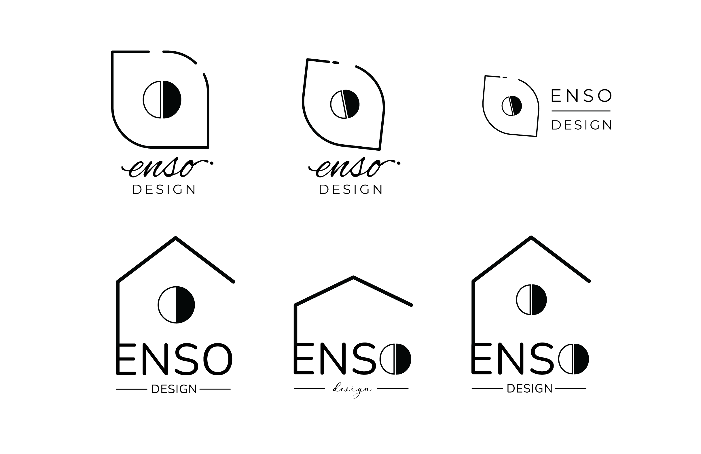
Backtracking from Bluestraw Home Design
We narrowed down the preferred branding personality that Camy strived to bring into her business, including characteristics like, quality, simplicity, and tranquility. We jumped around several iterations; one possibility being Blue Straw Design before fully committing to Enso Design

Saying “Yes” to Enso Design!
The meaning of “Enso” derives from the Japanese word meaning "circle" or "circular form", which represents the Zen Buddhism teachings of enlightenment, strength, and the true nature of reality, naturally giving a beautiful ring to Camy’s newfound business and branding.
To elevate the meaning of the word, I used symbolic imagery of circular motions, organic shapes, and and simple linework. We recycled elements of my older iterations from the Bluestraw Home Design logo designs, incorporating them into the logo designing process for Enso Design.
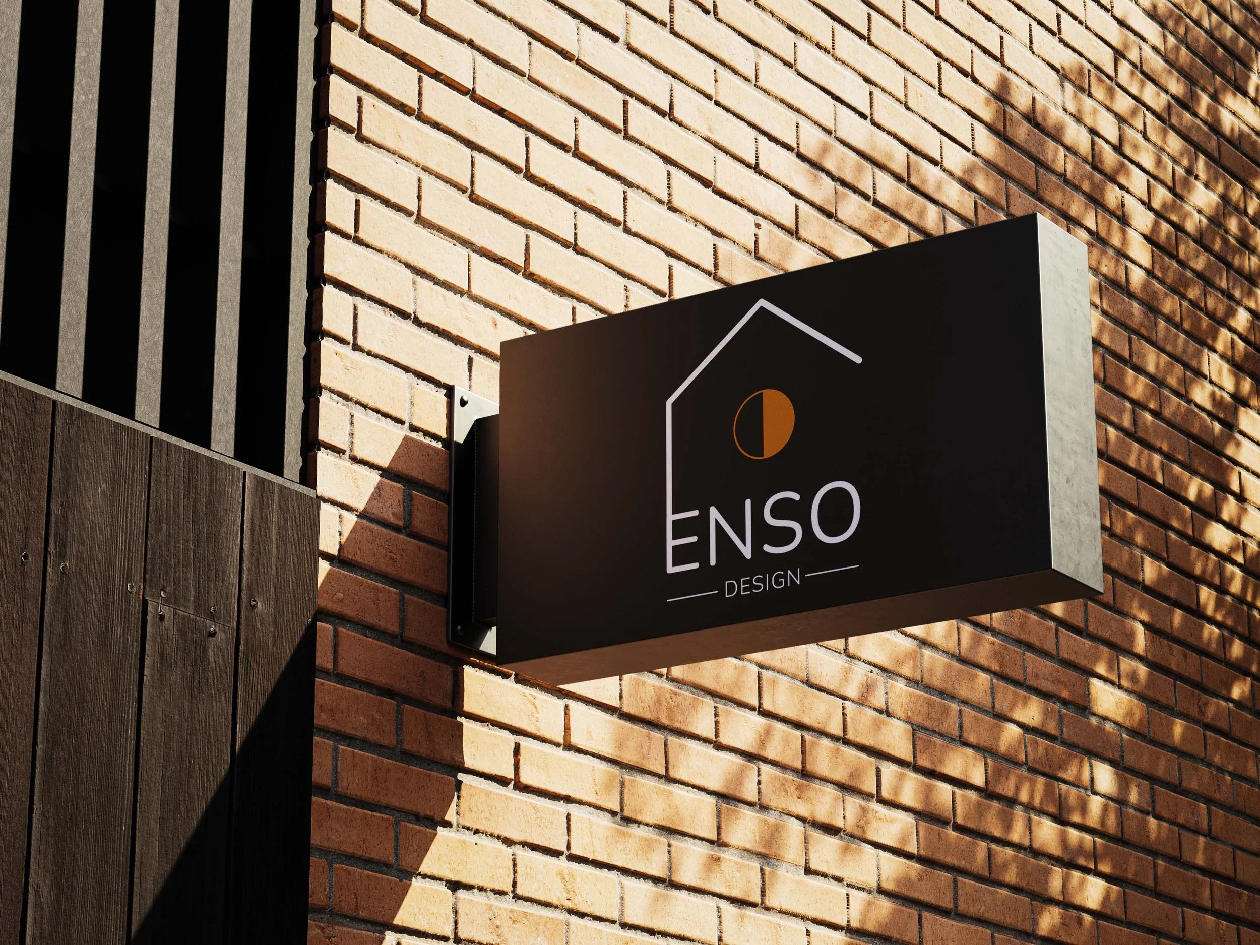
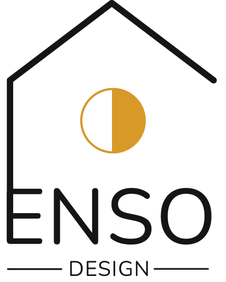
Final Logo
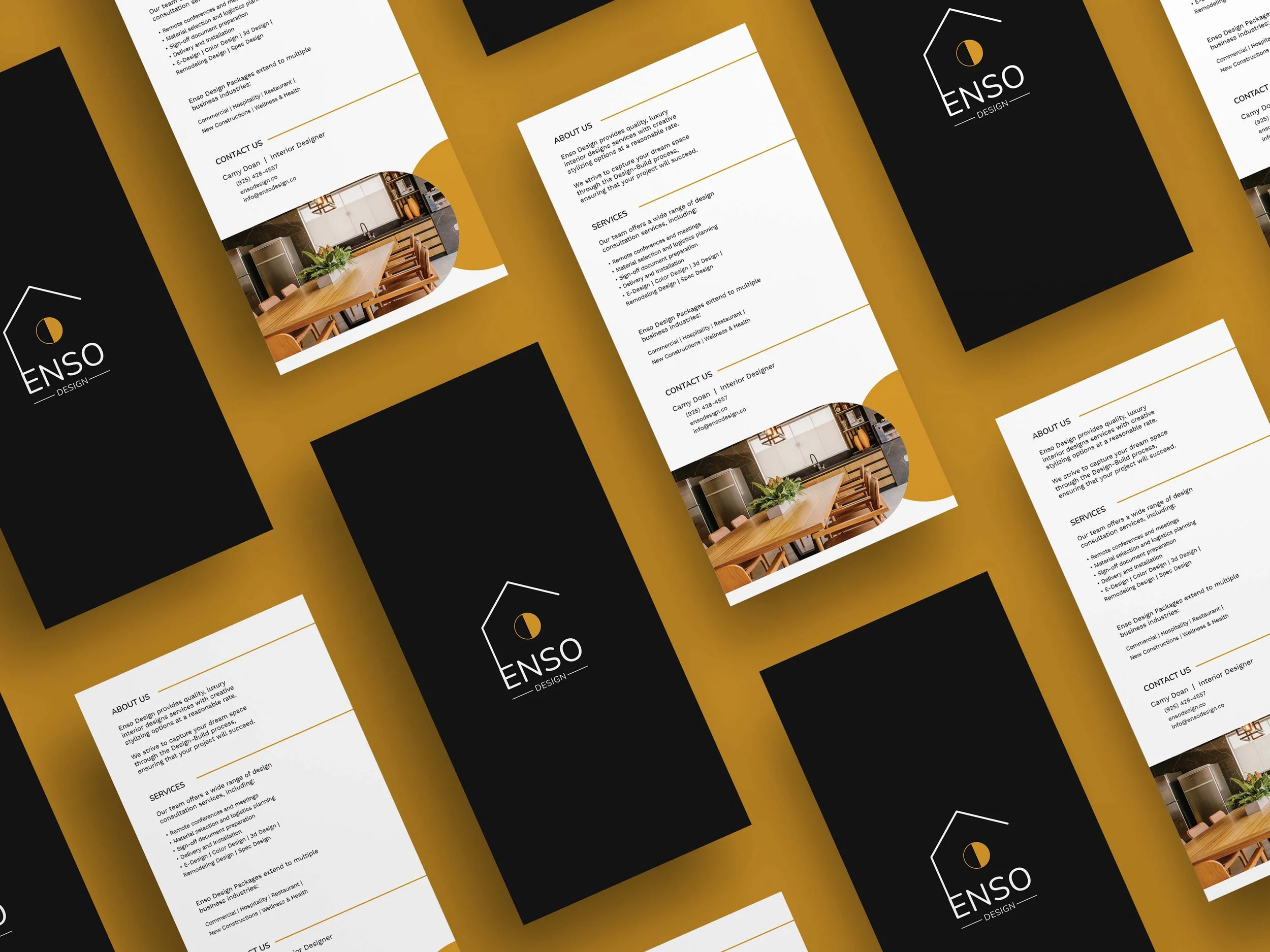
The final logo design of Enso Design uses symbolism that emphasize home design and Zen Buddhism, inviting the viewer to notice the half-filled circle as the main visual focus. I intentionally designed the logo with the idea of using gold foil material when printing, adding a touch of luxury to its branding.


MARKETING COLLATERAL
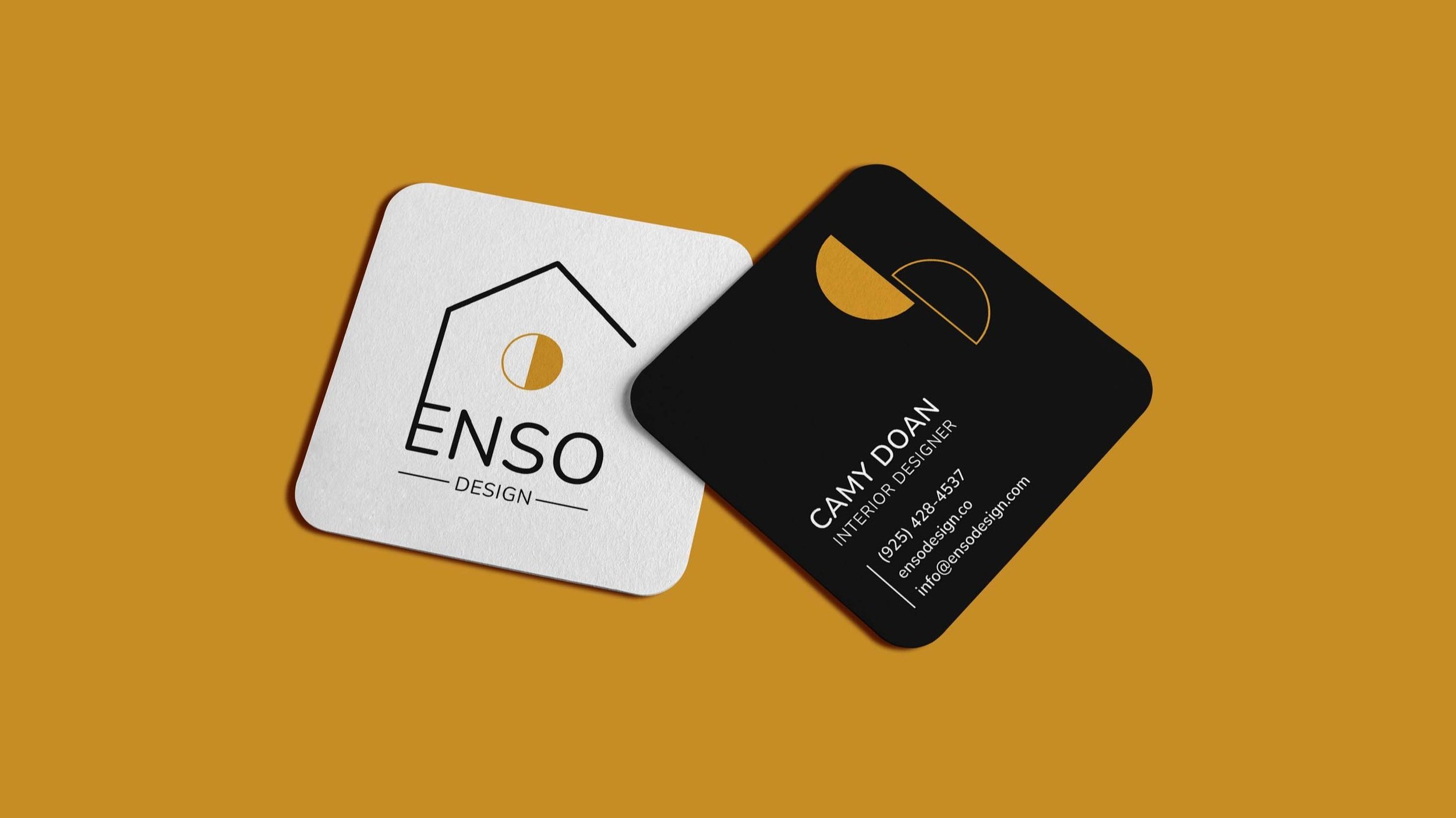
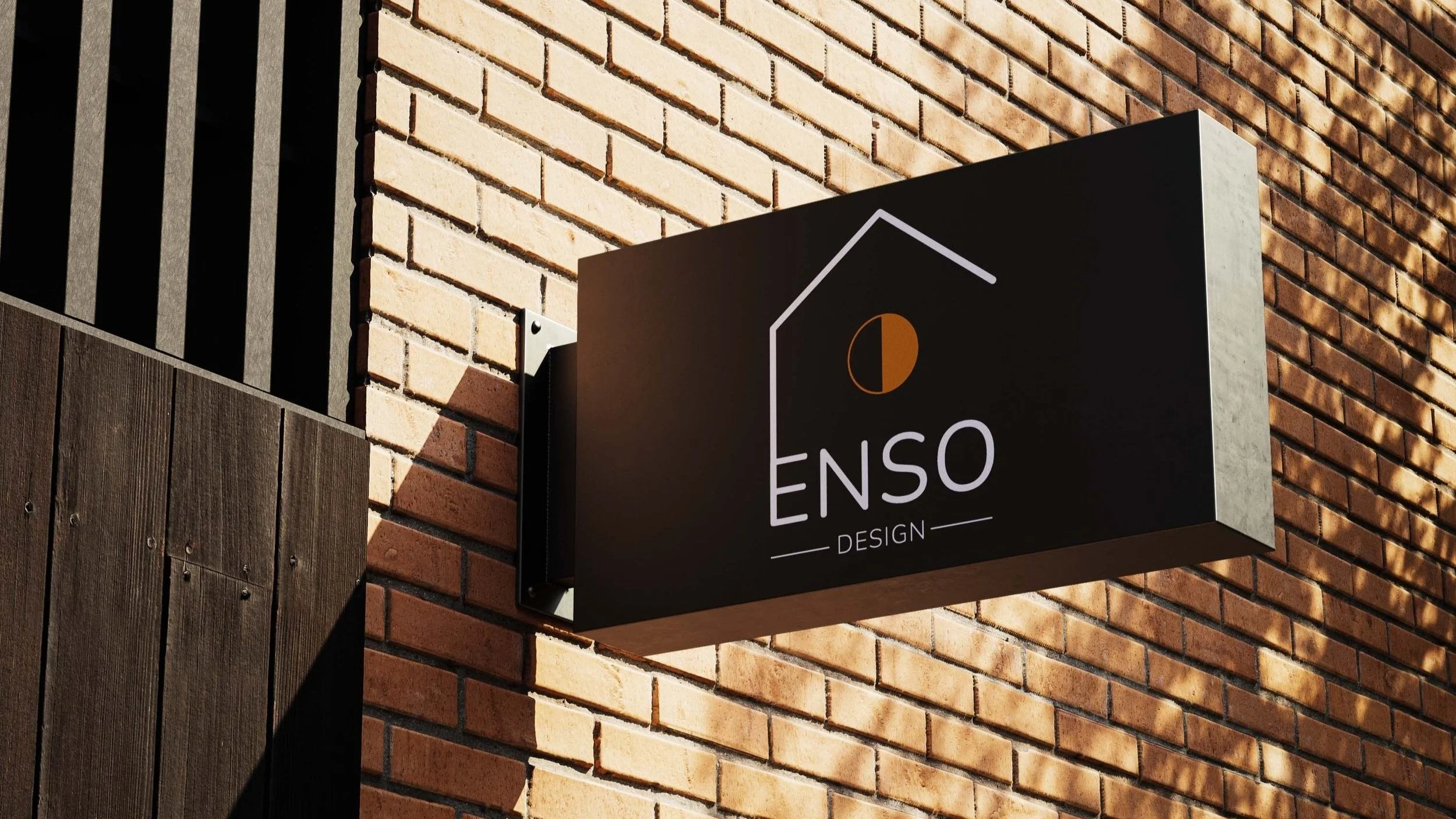
Creating a Branding Identity
I designed a handful of marketing pieces to bundle with her consultation collateral package, encouraging more professional consistency that can give an everlasting impression of her business.
We devised multiple pieces of collateral, including her business card, signage, introductory flyer, design booklet, and other stationery assets.

TAKEAWAY
Admittedly, getting lost in the sauce with design is something I struggle with, but I find it fun enough to keep looking at all the possibilities until I’ve exhausted my options. It was a joy working with Camy, and taking a peek into her world of ideas turned my creative gears.
Improvements for next time:
Having many ideas to work with can be a great work flow, but presenting too many designs to a client can be extremely debilitating. Not everyone is born a designer or a hard decision-maker, and it’s the designer’s responsibility to translate the best solutions for their client to select from.
Since it was Camy’s first time starting a business, it was challenging find the right process for every step. To make it less overwhelming, I typed up a series of simple questions to gauge her business model and values, making it easier for the both of us to understand her audience and overall branding personality.